File talk:Bank of China Tower massing model.svg
Jump to navigation
Jump to search
Feedback on Bank_of_China_Tower_massing_model.svg[edit]
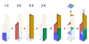
Last June, @El Grafo: left constructive feedback on file:Bank_of_China_Tower_massing_model.svg. As they seem to have some expertise in aesthetics, I wonder if I can get their critique on my updated diagram. I've addressed their points below:
- The whole nX thing only becomes clear after reading the description and looking at a picture like File:Bank of China Tower in Hong Kong.jpg. And even afterwards, I don't quite understand how this would be relevant for what's being shown here.
- It attempts to explain the 3D shape of the building and how it can be developed from simple primitives. I've added X shapes on the outer faces, and half-X shapes on the inner ones, and sorted the prisms by increasing height to hint what "1 X" and "2 X" mean.
- It feels crammed, and the labels, pluses and arrows are a tad too dominant.
- I've spaced the panels out and made the symbols less bold.
- The chosen colors remind me of 1990's Excel defaults for diagrams, which were easy to distinguish but not particularly pleasing to the eye, to say it mildly.
- I'm unsure how to pick pleasing colours from the web-safe palette. Nevertheless, I've updated the colours to be brighter and more colour-blind friendly.
- I've got the feeling that reserving the brightest/punchiest colors for the small triangles on top may not help with visual attractiveness.
- I've darkened the caps of the prisms. If they mean the pyramid, it's to correspond to a virtual light above.
- One problem is that the pyramid in the second panel from the right is poking out of the whole arrangement in a way that is not balanced with what the nX are doing. That could be counter-balanced by moving the nX further up, but then you increase the white space between them and the drawing below. Balance that by moving the panels further apart (too tight anyway), keep adjusting until everything falls into place.
- I've moved the labels up and moved the panels apart. I can't evaluate when things fall into place. As I don't have a natural feel for aesthetics and need to go by heuristics, do they have specific rules of thumb I can follow?
I also added a drop-shadow to make the prisms more anchored to the "ground". Looking forward to learning from them.
Thanks in advance,
cmɢʟee ⋅τaʟκ 17:38, 18 January 2023 (UTC)
- @Cmglee Looks so much better to me! Much more balanced and the colors look more friendly too without being overly punchy.
- The half X shapes I find a bit confusing, though: 1) visually, they are a zig-zag line to me, not half Xes 2) I seems like a two of these "half" Xes would have a larger area than one of the regular Xes. Afaict, the full X corresponds to the (presumably square-shaped) base area the building is standing on, right? Are you sure that double the short side (i.e. the diagonal of that square) of one of those triangles is the same as the long side of one of those triangles (i.e. one side of the square)? It's been a while since I've done trigonometry, but that doesn't feel right to me ...
- And since this is about at 3D shape, why not use a volume (cube) as the base unit rather than an area (square)? Cutting down a simple volume into smaller sections for me is easier to process than starting with an area (X) and then extending that into 3D space to get a volume. The volume of the blue column is 1/4 of the cube a size of the building's footprint (plus the quarter pyramid on top plus a bit on the bottom).
- Or maybe I got it wrong and you think of "X" referring to the whole prism. That could work too, if you make it a bit clearer that the green column is just two of those prisms stacked on top of each other - simply add another horizontal line between the two stacked X's in the green column. Remove the zig-zags from the red and yellow columns and give them those horizontal dividers too. Sorry of that doesn't help much, it's difficult to describe in words what I have in mind ... El Grafo (talk) 10:49, 19 January 2023 (UTC)
- Thanks, @El Grafo: I think I see the confusion; the Xs I referred to are the cross shapes on the facades not the X on the ground. I've labelled them in the updated diagram.
- I prefer using prisms (splitting the tower horizontally rather than vertically) as the pyramid parts naturally cap the prisms. It also matches File:Willis_Tower_tube_structure.svg better.
- Cheers,
cmɢʟee ⋅τaʟκ 13:40, 20 January 2023 (UTC)
